Deliverable 07 · Design
Design System & Style Guide
The crest, color tokens, typography, components, iconography, imagery and voice & tone.
Brand & crest
Palmetto Ridge has two stories to tell at once: a college founded in 1894 whose students built Old Main by hand, and a modern, diverse junior college with a LEED-Gold campus. The identity holds both: a traditional crest and serif type, set in a clean, open layout.

The college crest
Scientia · Virtus · Servitium: knowledge, character, service.
1Palmetto and crescent. Taken from the South Carolina flag, rooting the college in its state and the Lowcountry.
2The ridge. The low rise the college is named for, where Old Main has stood since 1902.
3The open book. Honors the first students, who made the bricks for Old Main themselves in 1902 and then studied inside it.
4The star. Marks the 1967 merger that joined two institutions into one college open to everyone in the county.
5The motto. Scientia · Virtus · Servitium (knowledge, character, service) on the ribbon.
Clear space
Let it breathe
Keep clear space around the crest equal to the width of the open book on every side. Nothing (text, photo edges, other logos) enters that zone.
Minimum size
40px wide on screen
Below 40px (or 0.5 in. in print) the motto and book detail break down. At small sizes, use the hawk mark instead.
Don’t
Never redraw it
Don’t stretch, recolor outside the palette, add shadows, or set the crest on a busy part of a photo. Use the one-color version on dark green.
Lockups
Primary
Crest + wordmark
Palmetto Ridge
Junior College
The site header, letterhead and official documents.
Reversed
On Ridge Green
The footer, page heroes and the portal sign-in. The wordmark turns white and “Junior College” turns Hawk Silver.
Athletics & spirit
The hawk mark

For the Hawks, the Hawk Portal, fact cards and small spaces. It never replaces the crest on academic or official material.
Color
Ridge Green leads, Hawk Silver supports and Heritage Brass is the accent, used sparingly. Every token lives as a CSS custom property in site.css, and every pairing used for text has been checked against WCAG 2.2 contrast.
#143426 · --green-800Headers, heroes, footer · 13.6:1 with white (AAA)#22573F · --green-600Buttons, links · 8.4:1 on white (AAA)#2E7052 · --green-500Eyebrows, hover borders · 5.9:1 on white (AA)#0F2A1E · --green-900Headings, stats band, utility bar · 15.3:1 with white (AAA)#17201B · --inkBody text · 16.7:1 on white (AAA)#C3CBD3 · --silver-300Text and eyebrows on dark green · 8.3:1 on Ridge Green (AAA). Never text on white (1.6:1)#8D99A6 · --silver-500Dividers, icons, large labels · 2.9:1 on white, so not for body text#B8903A · --brassFocus ring, quote rules, accents · 3.0:1 on white (meets 3:1 for non-text)#F8F6F0 · --creamAlternate sections, fact cards · Ink on Cream 15.4:1 (AAA)#56615B · --mutedSecondary text, captions · 6.4:1 on white (AA)Rule of thumb: roughly 60% white and cream, 30% green, 10% silver and brass. Brass is a highlight, never a background for text.
Typography
Libre Caslon Text gives headings the voice of a college that has been here since 1894. Public Sans, designed for U.S. government websites, keeps body text plain, legible and friendly on any screen. Both are free, open-source Google Fonts.
Our History
Six pathways. Thirty-three programs.
Two campuses. One story.
Start close to home, finish wherever you’re headed.
Our nursing graduates posted a 98% first-time pass rate on the NCLEX, and most are working in Lowcountry hospitals within three months.
Health Sciences
Photo: Welcome Week on the Ridgeview Campus quad.
Contrast in kind
A high-contrast old-style serif with a neutral grotesque. They never compete because they never try to do the same job.
Serif only at size
Caslon is used from 18px up. Anything smaller (labels, forms, tables) is Public Sans, which holds up better at small sizes.
Fluid headings
Hero and section headings use clamp(), so a 62px desktop headline scales smoothly down to 38px on a phone.
Spacing & layout
A small set of fixed numbers keeps every page consistent, whether it was built in the theme or by an editor in Drupal.
1200px
Max container width
32px
Side gutters (16px on phones)
8px
Base grid: 8, 16, 24, 32, 56, 84
14px
Corner radius (--r)
| Breakpoint | What changes |
|---|---|
| 1100px | Main menu tightens; 4-column grids (teams, stats) drop to 3 or 2. |
| 980px | Menu collapses behind a Menu button; sidebars and fact cards move above content; 3-column grids become 2. |
| 640px | Single column everywhere; gutters drop to 16px; buttons go full width in forms and calls to action. |
- Sections use 84px vertical padding on desktop, so the page reads as a series of calm, distinct bands.
- Body text never runs wider than about 780px (roughly 75 characters per line).
- Cards in a row always share the same height so titles and buttons line up.
Components
These are live examples using the theme’s real CSS classes, not pictures of them. If a style changes in site.css, it changes here too.
Buttons · .btn
Pill-shaped, 15px bold, at least 44px tall. One primary button per area; outline for the second choice; light on dark green.
Chips & eyebrow · .chip · .eyebrow
Future Students
A.A.S. Certificate Evening Online
Chips label credentials, formats and categories. Eyebrows sit above headings to name the section or area.
News card · .card

Academics · Oct 2
Learning Commons adds evening tutoring hours
Free drop-in tutoring now runs until 9 p.m., Monday through Thursday.
Event row · .event-row + .datebox
Fall Open House
Ridgeview Campus · Tours in English, Spanish & Vietnamese
Spring 2027 Registration Opens
All day · Hawk Portal
Area of study tile · .area
Health Sciences
Nursing (ADN), Radiologic Technology, EMT-Paramedic, Medical Assisting
6 programsNotice · .notice
Numbered steps · .steps
- Apply onlineFree, about 15 minutes.
- Complete the FAFSAUse school code on the Financial Aid page.
- Meet your advisorPlan your first semester together.
Iconography
One icon style across the whole site: simple line icons on a 24px grid with a 1.8px stroke, round caps and round joins, in the Lucide style. They inherit the text color, so they work on white, cream and dark green without separate versions.
Where they appear
The six areas of study, Hawk Portal navigation and quick links, Staff Dashboard tiles and stat cards, and the utility bar’s portal link.
Revised at sign-off
The first prototype used filled, detailed icons. The client found them busy next to the crest, so they were redrawn as lighter line icons. This was the one revision before approval.
Always with a label
Icons support words; they never replace them. Decorative icons carry aria-hidden="true", and icon-only buttons (like Menu) have a text label for screen readers.
Icons are inline SVG from a shared template (prjc-icons.html.twig) or CSS masks, so there is no icon font and no extra download.
Imagery
Photography should look like a real Tuesday at Palmetto Ridge: students of every background working, laughing and learning together, in natural light, on recognizable parts of both campuses. With 58% students of color and 41% first-generation students, the people in our photos should look like the people in our classrooms.
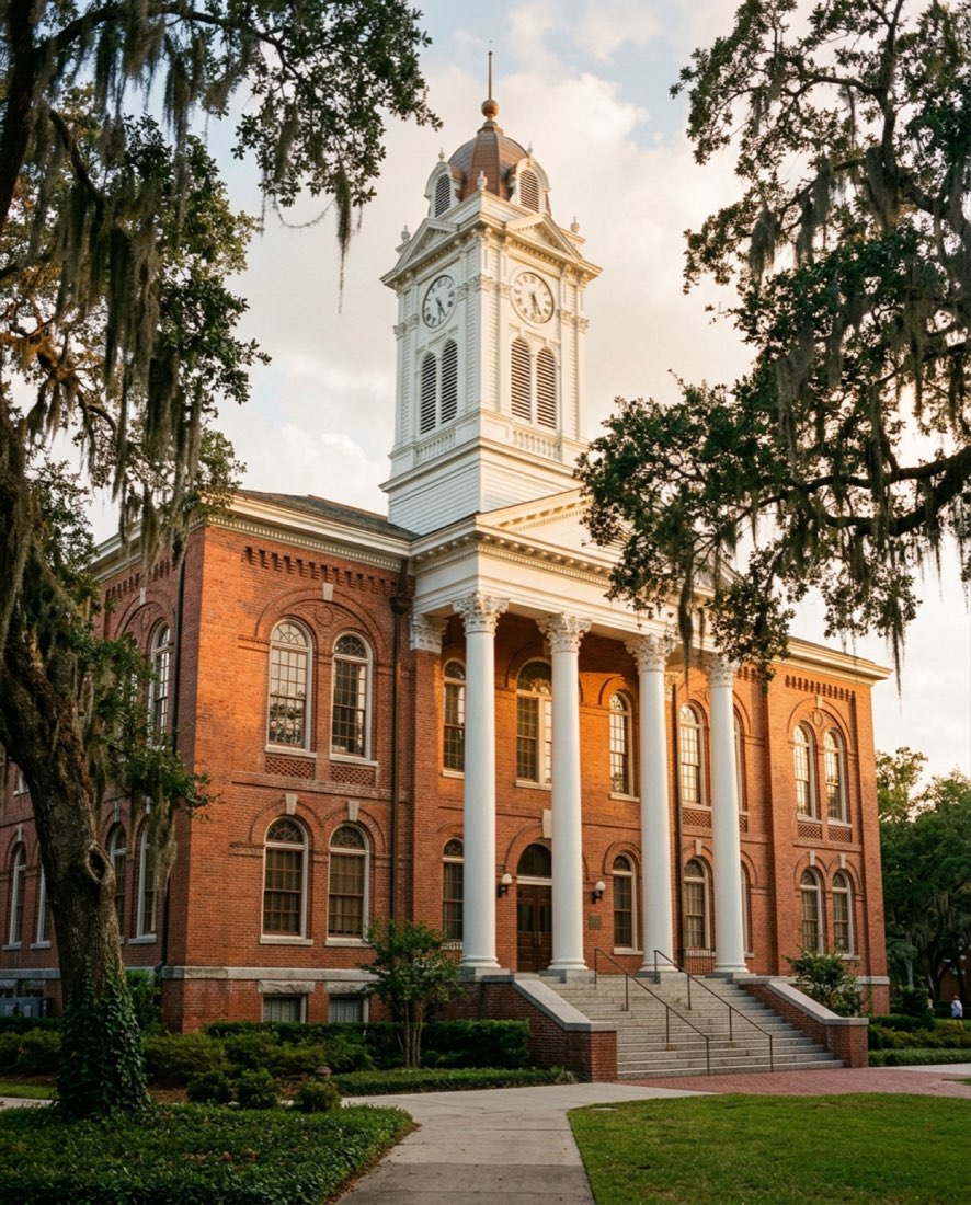 Old Main, 1902
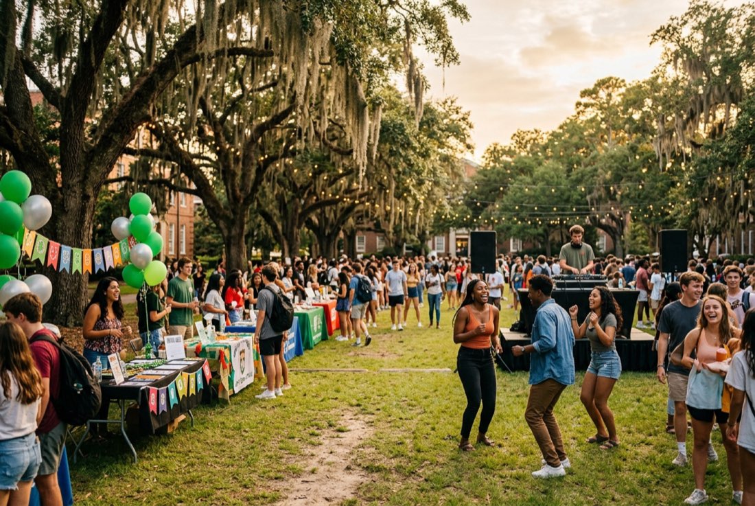 Welcome Week
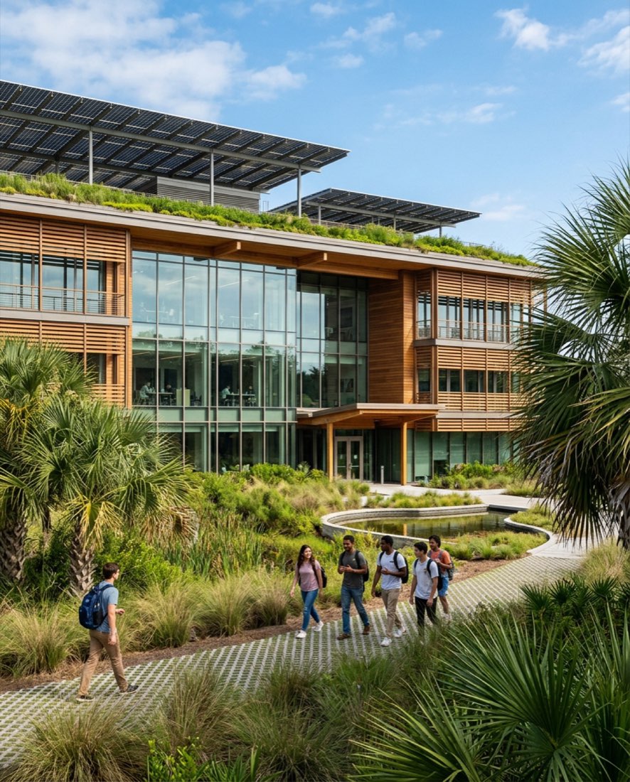 Ridgeview Campus, 2019
Guidelines
- Real moments over posed lineups; people doing something.
- Show the full range of students: age, race, ability, returning adults, veterans.
- Warm, natural light. No heavy filters or duotones over faces.
- Pair old and new: Old Main’s brick with Ridgeview’s glass.
- Leave calm space on one side of hero images for the headline.
Alt text rules
- Describe what matters in context, in one sentence.
- Don’t start with “Image of” or “Photo of.”
- Purely decorative images get empty alt (
alt=""). - Captions name places and events; alt text describes the scene.
- Drupal makes alt text a required field on every image upload.
About these photos: Palmetto Ridge is a fictional college, so its 109 photographs come from two sources: 95 were AI-generated with Figma for this demo (homepage, programs, news, teams, the directory headshots and a few events), and 14 event photos are free Unsplash photos used under the Unsplash License, with photographers credited in the project’s image credits file. All are placeholders for real campus photography, which is on the launch checklist.
Voice & tone
Warm, direct and encouraging. Many of our readers are the first in their family to go to college, so we write like a helpful advisor, not a catalog.
| Principle | Do | Don’t |
|---|---|---|
| Plain language | “Fill out the FAFSA so we can see what aid you qualify for.” | “Students must complete the Free Application for Federal Student Aid to determine Title IV eligibility.” |
| Lead with strengths | “98% of our nursing graduates pass the NCLEX on their first try.” | “Despite being a small college, we have a good nursing program.” |
| Talk to “you” | “You can start in January or August.” | “Applicants may matriculate in the spring or fall term.” |
| Avoid jargon | “A two-year degree that transfers to a university.” | “A.A. with articulation agreements.” (without explaining it) |
| Welcome everyone | “Información disponible en español. Llámenos o visítenos.” | Assuming every family reads English, or hiding Spanish help in the footer. |
| Be specific | “Open House is Saturday, Oct 17, on the Ridgeview Campus.” | “Join us for upcoming events!” |
Accessibility in the system
Accessibility is built into the tokens and components, so editors get it by default instead of having to remember it. The target is WCAG 2.2 AA.
AA
All text pairings meet 4.5:1 (most reach AAA)
3px
Brass focus ring, 2px offset, on every interactive element
44px
Minimum tap target for buttons, menu items and toggles
0
Carousels or autoplaying media; motion is limited to small hover lifts
- Visible focus with
:focus-visible, never removed. - A “Skip to main content” link as the first focusable element.
- Links are underlined in body text, not identified by color alone.
- No essential information is conveyed by motion; a
prefers-reduced-motionrule switches off hover lifts, photo zooms and smooth scrolling for anyone who asks their device for less motion. - Form fields always have visible labels, not placeholder-only.
- Heading levels follow the page outline; one H1 per page.
Palmetto Ridge Junior College is a fictional institution. This case study demonstrates process and deliverables for portfolio purposes.